Project Mania…An entire month of projects!

projectmaniamonth_carinagardner1

img_6708_smWe’re getting started a bit early here (Project Mania officially starts on September 1st!), but I wanted to make sure that everyone has a chance to participate! I’m giving everyone a head start here so that if you have any big projects that need starting or need to clear out your schedule to make way for some great projects in September, you have the time to!

This is a BLOG HOP! Here on my blog, I’ll be posting a plethora of new projects, tutorials, and free downloads to help inspire you. If YOU have been working on some things and want to share OR if you’ve needed a kick start, this is it! Time to get your hands dirty and get going! We all want to see what you’ve done! Whether it is scrapbooking related, sewing, home decor, home organization, crafts…if you’ve been meaning to do it, let’s get it done this September and post it on our blogs! You’ll definitely see plenty from me on these fronts all September.

So you think you want to share what you’re going to be doing September 2009? We’re starting a list right here! First thing you need to do is grab this html code and the little banner to put on your blog. It will relocate you back to this post for the most up-to-date list on blogs/websites participating in Project Mania.


<a href=”https://carinagardner.com/2009/08/06/project-mania/” target=”_blank”><img class=”alignnone” src=”http://i231.photobucket.com/albums/ee297/diginirvana/projectmania1.jpg” alt=”” width=”200″ height=”150″ /></a>

Next, you need to send me the name of your blog and the link you want it to go to so that we can all drop by and see what kinds of things you are getting into! Send it to carina@diginirvana.com.

Here’s the list of everyone participating! Go visit and see what these Project Maniacs are up to!

Carina Gardner Studio (Me)

The Project Girl

Mean Mom Digital Productions

Brought to You By The Letter B

live laugh LOVE scrapbook

Life’s Little Moments

Naomi’s Space

Sophia’s World

My Creative Space

Silhouette Design Store JOANN Stores

The First Steps to Becoming a Designer

I get asked alot “how to become a designer.” There’s really no straight answer to a question like that. I think people are so interested because creativity is an essential part of all our lives. Trying to figure out ways to channel that creativy into a career seems possible by becoming a “designer.” With a little bit of luck and a WHOLE LOT OF WORK, becoming a “creative” is possible. When I say a whole lot of work, I really mean it. Learning the tools of the trade and bettering your eye for building beautiful work are only the first steps. Then comes execution, execution, and more execution. Sometimes I make, make, and make with nothing to show for it.

I received an email from someone asking how they could get started and I thought I would share my advice. I have repeated this advice many times to others who have asked (which is why I decided to share:). I taught graphic design for 5 years at the University of Minnesota and practiced as I taught. My insights might be tainted as a “trained” designer, but I find that raw talent is far and few between and most of us (myself included) needed training to do what I do now. So here’s my email:

Hi,
Thanks for your comment on my blog. The number one thing I can tell you to do is go take a class—get a little more school. It will help you learn the programs you need to get started. Learning Photoshop, Illustrator, and InDesign is not for the faint of heart, but completely worth it to become a competent (and fast) designer. Second, you need at least ONE (if not more) theory class. Something that will really help you to SEE like a graphic designer. Building your visual skills is SO important. Night classes can be taken at your community college or local university.  From there, you’ll sort of figure out what you are good at, how much more school you really need, and how best to approach a career change. It will not be easy, but if you love design, it will be fulfilling.

Good luck!
Carina

Silhouette Design Store JOANN Stores

Finding Design in Everything: Form and Function

I was thinking about form vs. function…the time old question of which comes first (think the chicken and the egg) and how they inform each other. Form, the shape or medium that an object or service is in, and function (how it acts or works—the purpose of the object). Designers often say “form follows function.” So for example, a chair isn’t really  functional if there is no seat. The form of the chair is dictated by what it’s purpose is (to sit in). 

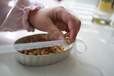
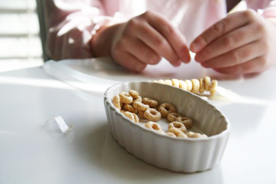
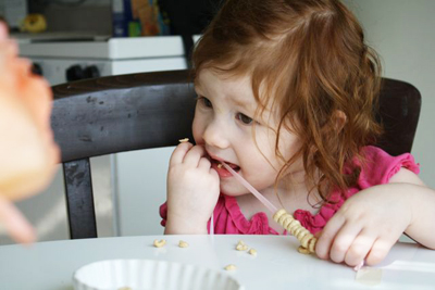
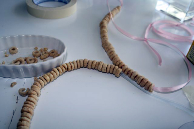
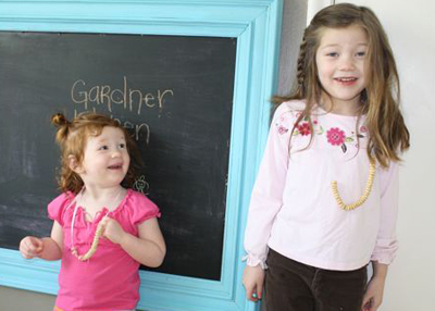
 I was thinking about this question in particular as it happens last Saturday. I was trying to figure out a fun afternoon activity for my kids. I came up with the age old “cheerio necklace” since we had everything for it. I was thinking about how a cheerio wouldn’t work for this fabulous activity if it wasn’t for the hole in the middle, therefore making it’s form “functional” for this activity. I mean, you’ve never heard of a Life necklace or a Captain Crunch necklace?

img_1315I have no idea why they chose the “o” shape for the cereal, but I found this if you want to know anything about the cooking process of these little cereals. Anyway, this is my very little tidbit on how form and function influences even the tiniest parts (and perhaps insignificant) of our lives. I sure do love those Cheerio necklaces! If you have a form vs. function story, please share! 

img_1322

img_1328

img_1339

img_1338

[ad]

Silhouette Design Store JOANN Stores

Interview with Designer Holly Jones & Giveaway from My Cute Stamps

I have a very special interview with designer Holly Jones today! She is the owner and creator of My Cute Stamps, an absolutely DARLING store with her beautiful clear stamps! She also has a fabulous blog Creating Cupcakes. She’s also offered a darling stamp set to be given away to someone! Let’s meet her:

logo

hollyjones

CarinaWhat kind of “designer” do you consider yourself? 

Holly: I started out as a graphic designer but as I worked at various jobs, I soon realized that I preferred Illustration over design. Now I consider myself an Illustrator.

Carina: Do you consider yourself a “creative” person?
HollyYes, growing up my dad owned a small print shop. I preferred playing with his trash (discarded papers, glue, inks, & etc.) more than I enjoyed playing with any of my toys. I love to learn new creative skills. I enjoy drawing, stamping, paper crafting, knitting, jewelry making, the list goes on & on.

CarinaDo you always feel creative?

HollyMost of the time. Most days I feel like there isn’t enough time to create everything I want to create.

Carina:  What kind of jobs have you had?

HollyMy 3 favorite jobs include: 1) Working at the computer lab it college. This is where I learned to use the computer & graphic design programs. I didn’t have a computer of my own until a few years ago, so it was fun to be able to use one everyday at work. 2) Being a “live in Nanny”. I got to explore the Eastern states with a great family whom I still keep in contact with. 3) Designer & Illustrator for Stampin’ Up! I worked here designing papers, products & stamp sets. I really enjoyed the environment and my fun and creative co-workers.

Carina: Tell me about being a mom and your “design work”.

Holly:  I work at home with my 2 cute girls. I wouldn’t trade it for anything, It can be challenging at times. My girls are both young and demand a lot of attention, so I really don’t get much work done until they go to bed at night. My oldest daughter is 4. She loves crafts, she has recently been interested in drawing her own stamp sets. She keeps asking when we will be selling her cute designs. I don’t think it will be much longer before she’s ahead of me in her creative skills.

Carina: What do you do now?

Holly:  Right now my husband and I have two businesses, Vinyl Wall Art & My Cute Stamps. He does most of the orders & technical stuff, while I do all the design work and marketing. I’m currently designing some new Reposition-able vinyl for Vinyl Wall Art, and getting our display for the Stamp business ready for the Salt Lake Scrapbook USA expo which takes place next week.

Carina: Tell me more about My Cute Stamps? What made you get started with that?

HollyInitially, I started doing Wall Art because I had a 2 year non-compete contract with Stampin’ Up! I still enjoy designing wall art, but I missed designing for the craft industry. My non-compete contract with Stampin’ Up! ended in October (the same month as my birthday) My husband thought it would be fun to order me some stamps that I designed in celebration of both occasions. I really loved designing the stamps, and had forgotten how much I love to design products for the crafting industry. I posted some of my stamp designs on the internet, and the response was fabulous, so we decided to set it up as a business. I’m really glad we did. I’m having a great time coming up with new set ideas & new product ideas (coming soon.)

Carina: What is your favorite stamp set?

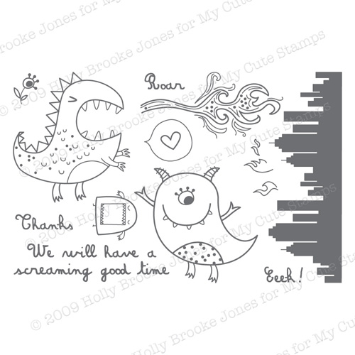
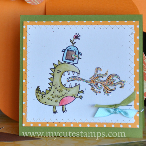
Holly: It would be Eek! A Monster!

monster4


monster2

Carina: Where do you see yourself in 10 years with your designwork?

HollyI hope to have an entire line of products within the next 10 years. More than just stamps, perhaps coordinating papers, and craft kits.

Carina: What makes My Cute Stamps Unique?

Holly: When I design new stamps, I really try to keep in mind how the stamps will be used. I try to make each set as versatile as possible. I want the end user to be able to use each set for multiple occasions and projects. 

GIVEAWAY FROM HOLLY!

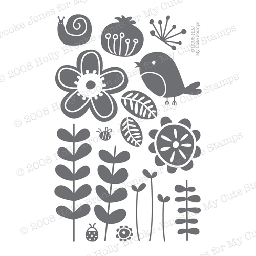
A big thank you to Holly for doing the interview! And she has been really generous to giveaway this darling stamp set: Spunky Nature Stamp Set! It’s my favorite set! 

spunkynature21

spunkynature


spunkynature3

What do you have to do to win it? Comment on this blog and your name will be entered into the drawing! If you go over to check out My Cute Stamps and tell me your favorite set, I’ll put your name in twice! Easy! This giveaway will end on Saturday at 9AM MST and winners will be announced on Saturday morning at 10AM MST.  Good luck!

Silhouette Design Store JOANN Stores

Why the Empty Space?

I have been meaning to write on this topic for sometime, but have kept putting it off. So here it is, a look at empty space and why designers love it and others do not. I started thinking about this because I was doing a project for work and had created this beautiful front cover for a program. The design only covered about one third of the area and was situated in the bottom left corner of the page. The design was sent back to me with a HUGE logo to cover the top portion of the program to “get rid of the empty space.”

So my question is, Why are people afraid of empty space? I have heard some of the following remarks: it’s boring, it doesn’t look like much time was spent on it, it’s too simple, or it makes it more interesting if it is all covered up.

It’s interesting that these are some of the reasons why “empty space” is a problem. First of all, empty space, or negative space or white space, as a designer would call it, is really important all on its own. Negative space allows us to focus in on what is important and to draw contrast between the foreground and background. The important thing is to make good use of your negative space

What do I mean by this? I mean, make your “empty space” count. Make it important. You do this by really creating an interesting shape with your background or doing things in the design that makes the foreground that much more important. 

I think the use of negative space and this question of “use of empty space” brings up the question of what a designer’s responsibilities are. Is our only job to to make things look pretty? I hope not. When I first got into design I felt like it was the perfect marriage between marketing and art. As far as I’m concerned, designers are organizers. We take visual information and organize it in a way that it is easy to understand visually. That’s why negative space is so important. We need it to help organize the different elements that need to co-exist and give accurate information.

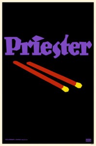
One way to do this is to simplify your designs. Probably the most famous example of a designer who decided to simplify his design is Lucian Bernhard. This German designer entered a competition for Priester matches and started out with a design with multiple layers of information and imagery. He stripped away everything until all he had left was the brand name and image of the product. 

mp5712priester-matches-posters

He won the competition because the poster clearly showed off the product and brand name. As a designer, that’s our job. To create focal point, the area where the eye rests or concentrates, that is strong and lets the audience know right away what the message is.

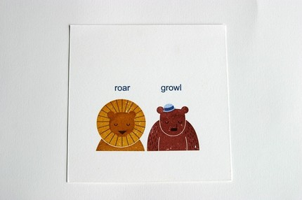
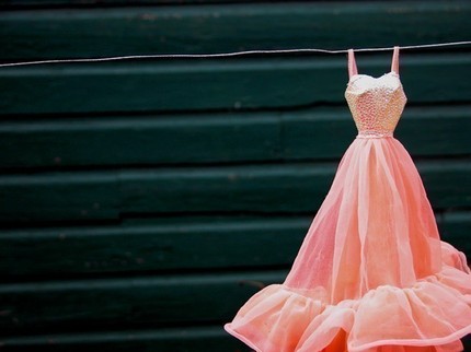
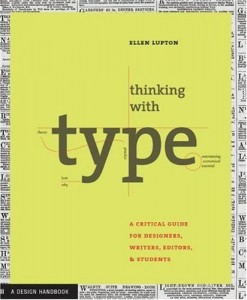
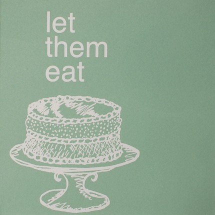
Here are a few examples negative space used well. Look at them and think very carefully about what your eyes is drawn to. Is there a logically way that you automatically look at this? Are you reading it left to right? Top to bottom? Or does the designer push you another way. 

Saul Bass (famous for his movie poster)


saulbass

KidsHaus RoarGrowl

growl-roar

Milton Glaser’s Bob Dylan Poster

dylan_poster

Michelle Brusgaard Photograph

mb_dress

Ellen Lupton’s Thinking with Type Cover

thinkingwithtype

BluLima’s Let Them Eat Cake Screenprint Poster

letthemeatcake

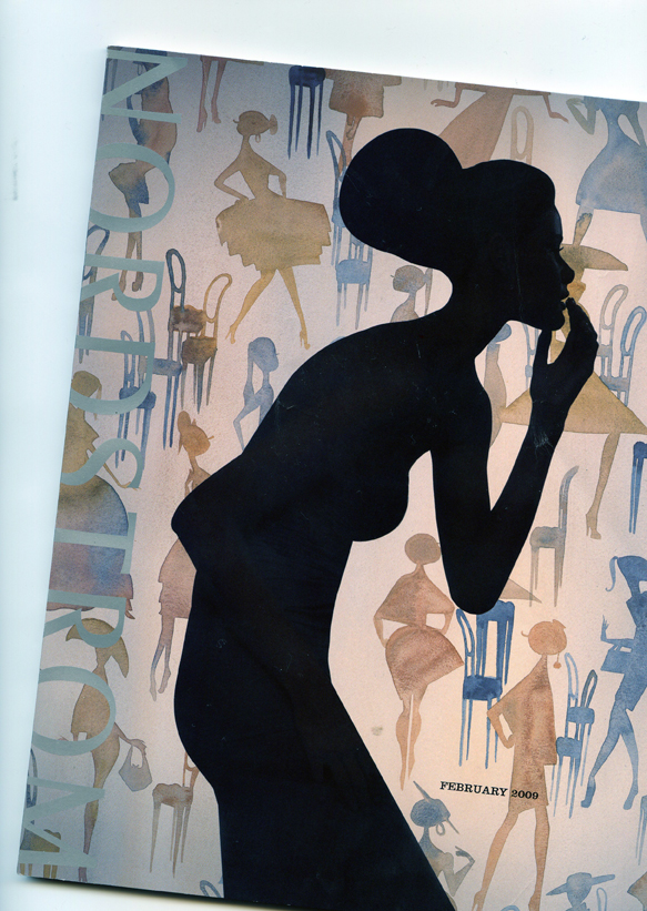
These are just a few examples to get you thinking about negative space. One thing to be aware of is that negative space doesn’t have to be completely solid…it can be a pattern, texture…as long as it acts as the background. I just got a Nordstroms catalog in the mail that does this very thing. Lots of little watercolored silhouettes make up the background and add interest to the cover without taking away from the foreground image.

nordstroms

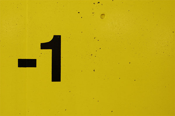
Here’s an article that explains how to use negative space in your artwork. They show some truly minimalist work where negative space is the main event. Check out the image with the -1. See how the use of texture still acts as negative space? Visit Tutorial 9.

negative1


Resources that you should check out!

Here’s a short article from a web designer who has a similar perspective on use of negative space. I like his short story and advice. Check out MyIntervals.

[ad]

Silhouette Design Store JOANN Stores

Foreground and Background: Learning to see

I think you’ll like this first lesson…it’s quick, but has lots of examples, which is always fun! The best part is once you understand background and foreground and how it works in design relationships, you will be able to see it in your scrapbook layouts, designs, or projects. It will give you a new sense of how space works FOR and AGAINST you.

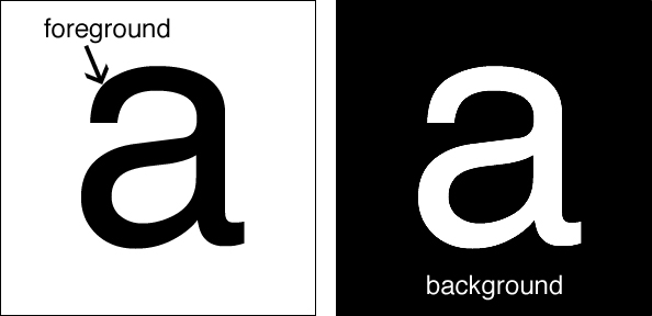
Foreground (also called figure-ground) is essentially the focal point, the area in the front of a space. The background is the area that surrounds that focal point. This can be easily shown with a letter.
foreback_a1
Many times it is easier to see the background if the color is reversed out. As a designer, you have the be very aware of what the background is doing (also called negative space) because that may help you rearrange elements so that the foreground or figure is remembered BEST and the background is just that…background. 

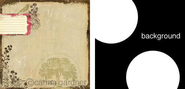
Take a look at this example.
foreback_exampleb
This is a paper from my Bella BellaTM Collection at My Minds Eye. I’ve blocked out the background and foreground for you so you can see what I did. Even though there are several elements in this page, the two focal points both help create a dynamic background. The diagonal works both ways…from the bird to the tree as well as the blank space at the top moving between the two objects. It sort of makes an x. Do you see it? It’s what keeps this balanced. It’s not PERFECTLY balanced, which is what would have happened if the tree element had gone in the right-hand corner. Instead, it is moved away from the corner to give it a little more interest and to create that funky background-arrow (the negative space).

Many designers like to play with this idea of foreground-background. Check out this clip of 300. I am not promoting the violence (because wow, this is a bit violent for me!), but it does a great job of showing off (and extenuating) the foreground-background relationship. Be sure to pay attention when objects appear as one thing and then are transformed into another… Just watch the first 30 second to a minute of this and you will get the idea.

Did you notice the horse hair into grass (take a second look!) or the landscape into a face and helmet. There is such a high contract between the background and foreground in this that it makes the relationship prominent. 

Here’s another one I love (notice how I am showing a lot of black and white? The relatioship is easy to see when there is such a strong contrast). Here’s Lemony Snicket’s end credits:

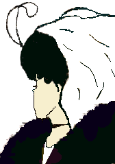
Designers really push the limits when they create illusions with the foreground and background. Check this out:
profileblk
ylady

These is a classic examples of foreground and background used to create optical illusions. Do you see the young lady and old lady in the second one? I had to squint and squint to see the old lady and I even had to flip it in photoshop so I could stop looking at the young lady. Hopefully, you had better luck than me! (to see more images like this, go to

http://www.azhearing.com/optical-illusions.htm#yyy and take their test.

Okay, hopefully you get the gist of foreground-background. Just keep the background in mind as you build your images, patterns, and more.

Silhouette Design Store JOANN Stores

How to Become a Designer

Becoming ANYTHING takes work, dedication, and passion. I know many people who really are interested in becoming designers. They want to know what they can do to become one. Many times formal training at a university is not an option, so I have a few words of advice of people who are interested in becoming designers or at least learning how to “see” like a designer. Before I get to the advice, however, I feel like you will find my words more valuable (or at least where I am coming from) if you know how I became a designer.

I didn’t go the traditional route to become a designer. I got my bachelor’s degree in Marketing Communications. It was safe for someone like me…I never felt “creative” enough to really be a designer. My senior year in my BA, I took a “creative advertising class.” The only problem was that I began to feel LIMITED because I couldn’t execute anything (all those good ideas going to waste!). You see, I didn’t know Photoshop, Illustrator, Quark, or InDesign. Not only that, but I really couldn’t tell if something was designed well. I could tell if the advertisement was executed properly but that doesn’t matter if the design completely detracts from the goal (and my sad skills always did).

In my frustration, I met a design intern, Jen Allyson at Continuing Education while I was the marketing intern there. There was obviously magic as she taught me my first ways of “seeing” the world a little differently. She taught me to pull out the ugly and inconsistent while pushing me to find the beautiful. My eyes hurt (literally hurt!) for 2 months as she helped me get together a design portfolio for the University of Minnesota so I could go to grad school. Grad School had always been the plan…but not design grad school. Somehow, I made it into the Design Communications program and went on to get a Masters and Ph.D. in design. I taught foundations classes, theory, typography, graphic design history, and packaging learning more and more as I taught. I made plenty of mistakes and had a few successes too. However, after 5 years of teaching, I found that I missed being a designer and needed to get back to my own creativity. I now have many outlets for my creativity (you can see my shops to the side) along with freelance work and in event planning. I had forgotten how much I LOVE being a designer and the passion I feel about it. (BTW, Jen is STILL my best friend, eight years later…)

Which comes to this blog and the information I plan to divulge on it:). I have to say first that I am not an expert, but I will bring to this blog all the design theory, tips, tricks, and information that will help you to learn to “see” as I did. If you are really, and I mean REALLY interested in becoming a designer, here are my first (and very broad) tips for you as you begin this journey. If you don’t want to be a designer, you just want to better decorate your home, energize your own creative spirit, or create a better scrapbook page than this is still the blog for you! I’ll have interviews with designers of LOTS of different things (graphic designers, industrial designers, interior designers) as well as posts on beautiful things, price comparisons for things I find absolutely delightful, design book reviews, and of course, previews of products coming to 2Peas, Card Nirvana, My Minds Eye, and more!

OKay, I’ve put it off enough….My Advice to get started designing!

1. Choose your medium

Are you completely passionate about your home? Do you move around furniture every chance you get? Do you doodle designs on napkins at the restaurant? Do you like the lines on a piece of clothing and want to imitate it? Finding your first medium is an important step. I say your first because design is like ivy: it creeps into every part of your life! I am primarily a graphic designer, but I love interiors too. I admire clothing designers, but I don’t feel the same passion for it as interiors and graphics (although believe me I will be glued to the TV for Project Runway like the rest of you!). So much of the design theory I add to this site comes from a graphic design background, but you’ll find it applicable to many other areas of your life you design.

2. Find ways to learn | Educate yourself

For most of you, formal training is out of the question. However, some tools are necessary and completely FRUSTRATING in this technology age. So if you want to learn how to digital scrapbook or design professionally, you may need to take a class on Photoshop or Illustrator. Believe me, it is way better than doing it the way I learned to do it: on my own. You can check listings at your local community college or rec center for classes or there are a myriad of online opportunities. I will try to scrounge up a list for you guys soon for those of you who want to go this route. I’d recommend for any designer to get your hands on magazines in your chosen field…so Communication Arts and PRINT for graphic designers. I don’t know what the official interior designer’s magazine, but for just pure eye candy I like domino magazine, dwell, and architectural digest. I will be adding several book reviews and recommendations over the coming blog entries so keep your eyes open, which brings me to my next point, which is

3. Surround yourself with Beauty

What I really mean is to become a designer, you have to re-learn how to see. Those of you who are designers, know what I am talking about. The only way to know the difference between good and bad design (a topic much too extensive to explore here: look for it in future post!) is to surround yourself with GOOD design. Now, I know you are thinking, how do I know if something is “good” design. For now, just try to spend time looking for things in your life that are beautiful to you…we’ll get into the “theory” of it soon enough. Is there a card you think is exceptionally beautiful? A couch that just makes you happy? What is it about these things that make you like them? Is it the way they look? How they function? Really think about the objects you have surrounding you and decided why you like or dislike those things. Check out websites for function (was it easy to navigate?) Did you like the colors? Did you like the shape? Read beautiful and inspiring magazines and books, buy pretty things to place in your home, decorate…in essence, LIVE BEAUTIFULLY! This is a tall order (I know, with two little ones and work, I feel lucky if I can get to the dishes), but what I am asking is SMALL steps. I plan on trying to take small steps to make my life more meaningful too…and I’ll share what I do with you and I can’t wait to hear what you share with me!

4. Practice. practice. practice.

Brillant design doesn’t come the first day of trying, nor the second. Even now, when I am working on a design, many times it is the 50th thumbnail that sticks, not the 10th. It sometimes takes getting through a lot of BAD design to get to something really good. Or I should say that sometimes it even takes a lot of good design to get to something great. So you are going to push your self. As Champ Bear would say, “Practice, Practice, Practice.” My designwork is certainly better now than it was 8 years ago when I first started out. Practicing your design work, whether in a scrapbook page layout, a furniture rearrangement, or wall-color choice are all ways to PRACTICE what your creative spirit needs. I say your creative spirit because WE ALL have creativity waiting to be released. Hopefully, with projects to come you will be able to do this! I certainly want to as I am ALWAYS needing new ways to develop as a designer.

Okay, so I gave you some tips, but the meat is to come. Welcome to design! Learning to “see” will give you more meaning in your life…don’t believe me? Continue to read and we’ll see. Perhaps all you need is a quick lesson on 1920s design, an inspiring interview with a designer turned successful business owner, or a post on the golden mean and how to use it. These are the little lessons that helped me learn how to be a designer and I hope they will make your life more meaningful.

Ready, set, design!

Silhouette Design Store JOANN Stores