I’m excited to introduce to you a series of videos straight from my studio! Introducing CG TV! I originally got the idea for doing the videos because I wanted to show tutorials on my sewing patterns. The idea eventually was expanded to include all the things I do here in the studio—paper, fabric, digital, hybrid, classes, sewing patterns, as well as projects, interviews, giveaways, and introduction into new designs.
So here it is—Episode 1! I’m excited that my first video introduces the Beautiful Moments™ Collection for Carta Bella Paper. You get a sneak peek into my studio where I film the videos and get to see me grow around the middle every month to boot!
As a kick off to the new videos, there is an awesome new giveaway in this video—so be sure to check it out! The winner will be announced on the Carta Bella Facebook Page on Monday, June 4, 2012.
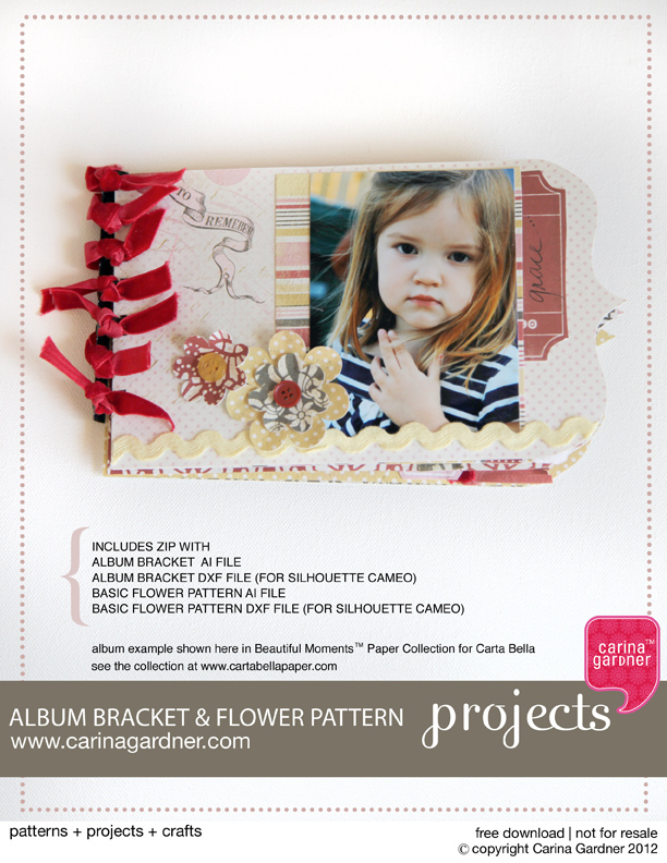
As promised, here is the free download of the album bracket and flowers I show in the video. I’ve included the following in this zip:
ALBUM BRACKET AI FILE
ALBUM BRACKET DXF FILE (FOR SILHOUETTE CAMEO)
ALBUM BRACKET JPG FILE
BASIC FLOWER PATTERN AI FILE
BASIC FLOWER PATTERN DXF FILE (FOR SILHOUETTE CAMEO)
BASIC FLOWER PATTERN JPG FILE
Sadly, this project download DOES NOT include instructions for making the album shown here. It simply includes all the fun templates for you to create an album like this one.
I think you’ll like this first lesson…it’s quick, but has lots of examples, which is always fun! The best part is once you understand background and foreground and how it works in design relationships, you will be able to see it in your scrapbook layouts, designs, or projects. It will give you a new sense of how space works FOR and AGAINST you.
Foreground (also called figure-ground) is essentially the focal point, the area in the front of a space. The background is the area that surrounds that focal point. This can be easily shown with a letter.
Many times it is easier to see the background if the color is reversed out. As a designer, you have the be very aware of what the background is doing (also called negative space) because that may help you rearrange elements so that the foreground or figure is remembered BEST and the background is just that…background.
Take a look at this example.
This is a paper from my Bella BellaTM Collection at My Minds Eye. I’ve blocked out the background and foreground for you so you can see what I did. Even though there are several elements in this page, the two focal points both help create a dynamic background. The diagonal works both ways…from the bird to the tree as well as the blank space at the top moving between the two objects. It sort of makes an x. Do you see it? It’s what keeps this balanced. It’s not PERFECTLY balanced, which is what would have happened if the tree element had gone in the right-hand corner. Instead, it is moved away from the corner to give it a little more interest and to create that funky background-arrow (the negative space).
Many designers like to play with this idea of foreground-background. Check out this clip of 300. I am not promoting the violence (because wow, this is a bit violent for me!), but it does a great job of showing off (and extenuating) the foreground-background relationship. Be sure to pay attention when objects appear as one thing and then are transformed into another… Just watch the first 30 second to a minute of this and you will get the idea.
Did you notice the horse hair into grass (take a second look!) or the landscape into a face and helmet. There is such a high contract between the background and foreground in this that it makes the relationship prominent.
Here’s another one I love (notice how I am showing a lot of black and white? The relatioship is easy to see when there is such a strong contrast). Here’s Lemony Snicket’s end credits:
Designers really push the limits when they create illusions with the foreground and background. Check this out:
These is a classic examples of foreground and background used to create optical illusions. Do you see the young lady and old lady in the second one? I had to squint and squint to see the old lady and I even had to flip it in photoshop so I could stop looking at the young lady. Hopefully, you had better luck than me! (to see more images like this, go to